Platform Redesign
Redesigning Class Registration at UCI
My Role
UX Researcher
UI Designer
Project Timeline
March 2023 - April 2023
(7 weeks)
Tools Utilized
Figma, HTML, CSS
Overview
A research-driven redesign of UCI’s outdated WebReg system, focused on reducing student stress and improving accessibility, navigation, and overall usability during class registration; Achieved an 80% reduction in browser tab usage.
Context
What is this project?
This was a seven-week UX project tackled by a team of five, focused on redesigning UCI’s outdated class registration system, WebReg. Our goal was to create a more intuitive, accessible, and efficient experience for students navigating course enrollment.
Current Challenges
The Cost of a Confusing System
Problem Statement
The Guiding Question
How can we improve the UCI class registration experience and make it more intuitive and stress-free for students?
Research
The Survey
We sent out a survey and circulated it throughout UCI. The survey asked students a range of questions gathering both qualitative and quantitative data.

What we found


responders had issues using the current WebReg system

responders wanted the Schedule of Classes integrated in the system

responders were frustrated with the interface of the system
User Quotes
“IT(webreg) NEVER LOADS and it's so difficult to navigate. I'll always get locked out and have to open a different browser to use it.”
“It (webreg) gets really confusing to work because the information I need is spread out in so many different places.”
Looking Around

To benchmark improvements, I studied UCLA’s enrollment system, which featured:
A well placed filtering panel for easy course discovery.
Color-coded restriction tags for quick comprehension.
Key Findings
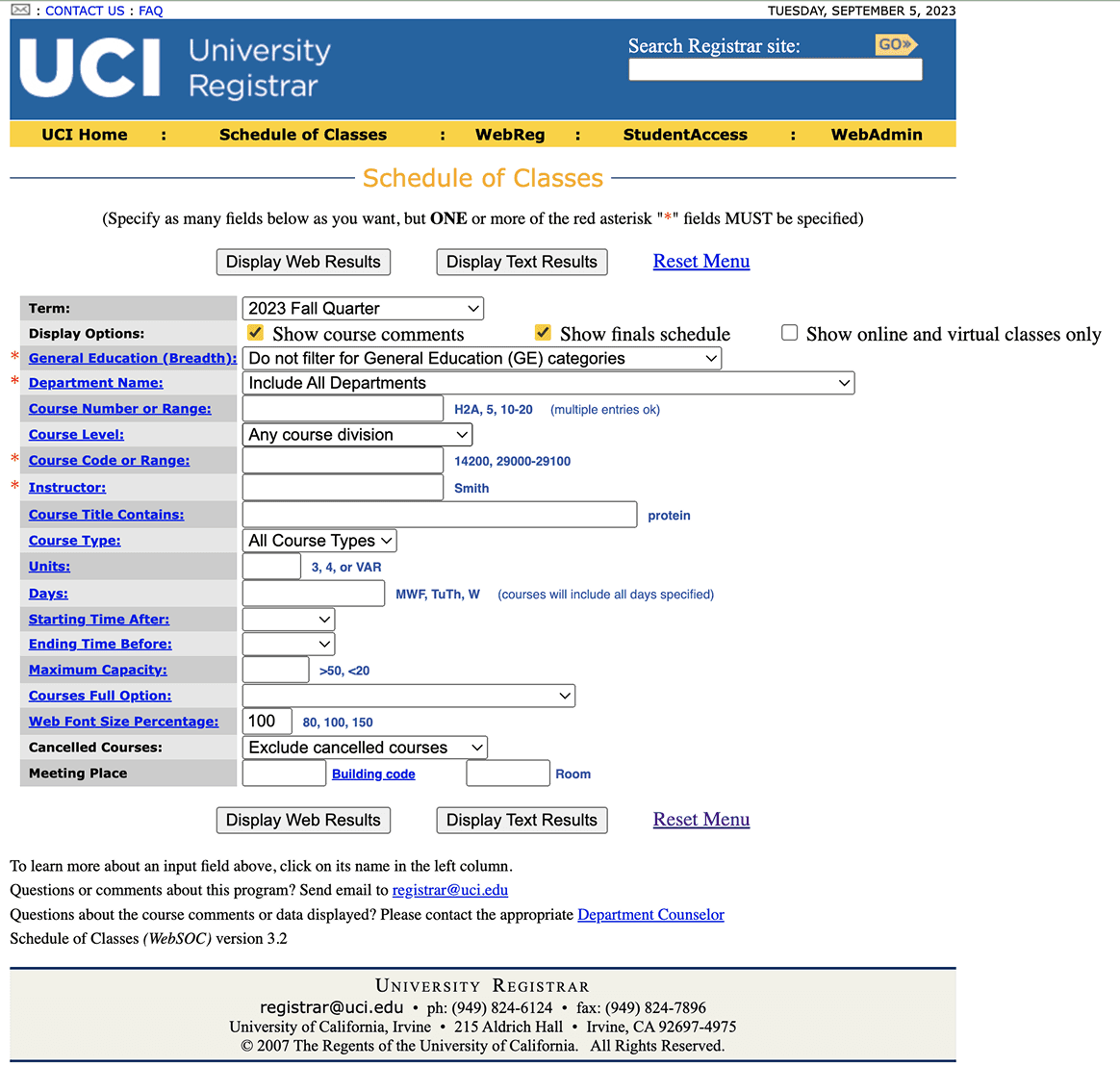
Students had to keep multiple browser tabs open to cross-check schedules, enroll, and verify class availability.
The system frequently crashed during peak enrollment periods.
The system had several accessibility shortcomings, like limited screen reader support and the absence of dynamic text resizing.
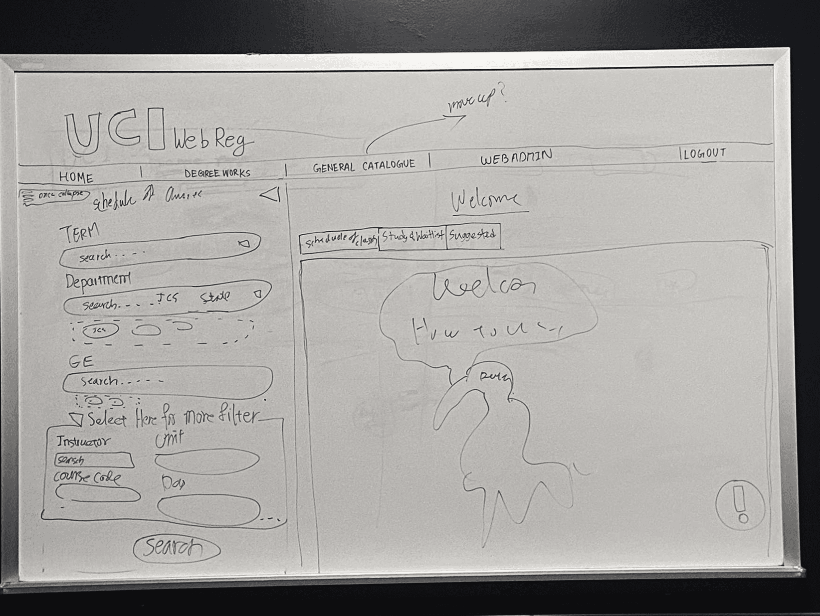
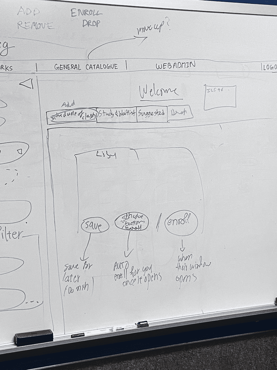
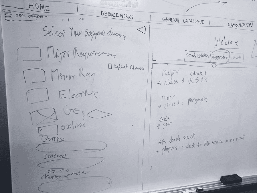
Wireframing
Whiteboard sketching

Mid fidelity prototypes


Presenting with Impact
We had the opportunity to present our redesign to a panel that included the UCI Registrar, faculty members, and fellow students. The format mirrored a professional business pitch, where we positioned our solution as a viable product in a competitive landscape. I led portions of the presentation, clearly communicating our research insights, design rationale, and product value. Out of 30 teams, we were honored to be selected as one of the top 5 finalists, which validated both our design thinking and our ability to articulate its impact. This was also the time we got some feedback on our designs which we took forward to implement in our final prototypes.
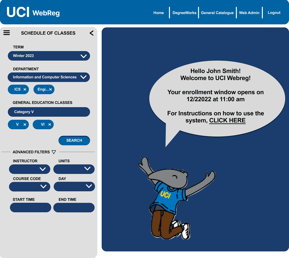
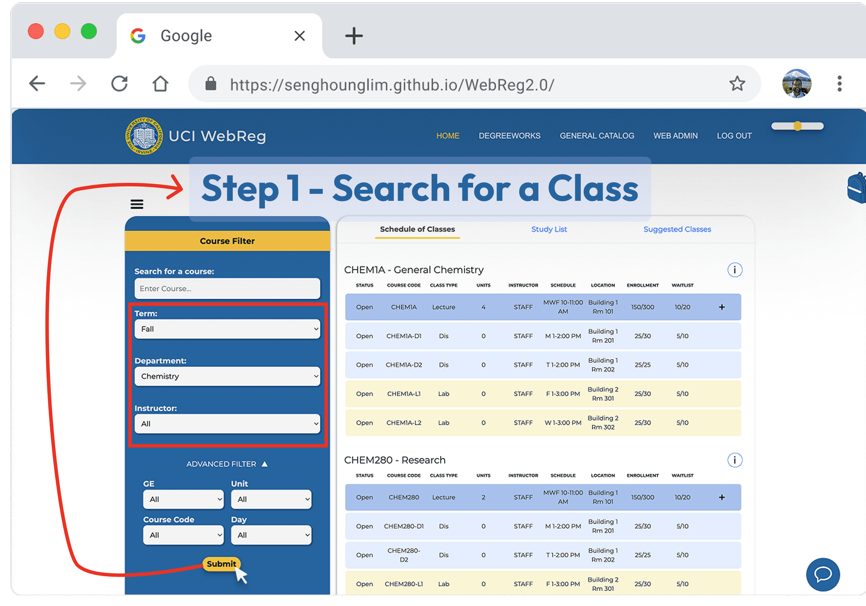
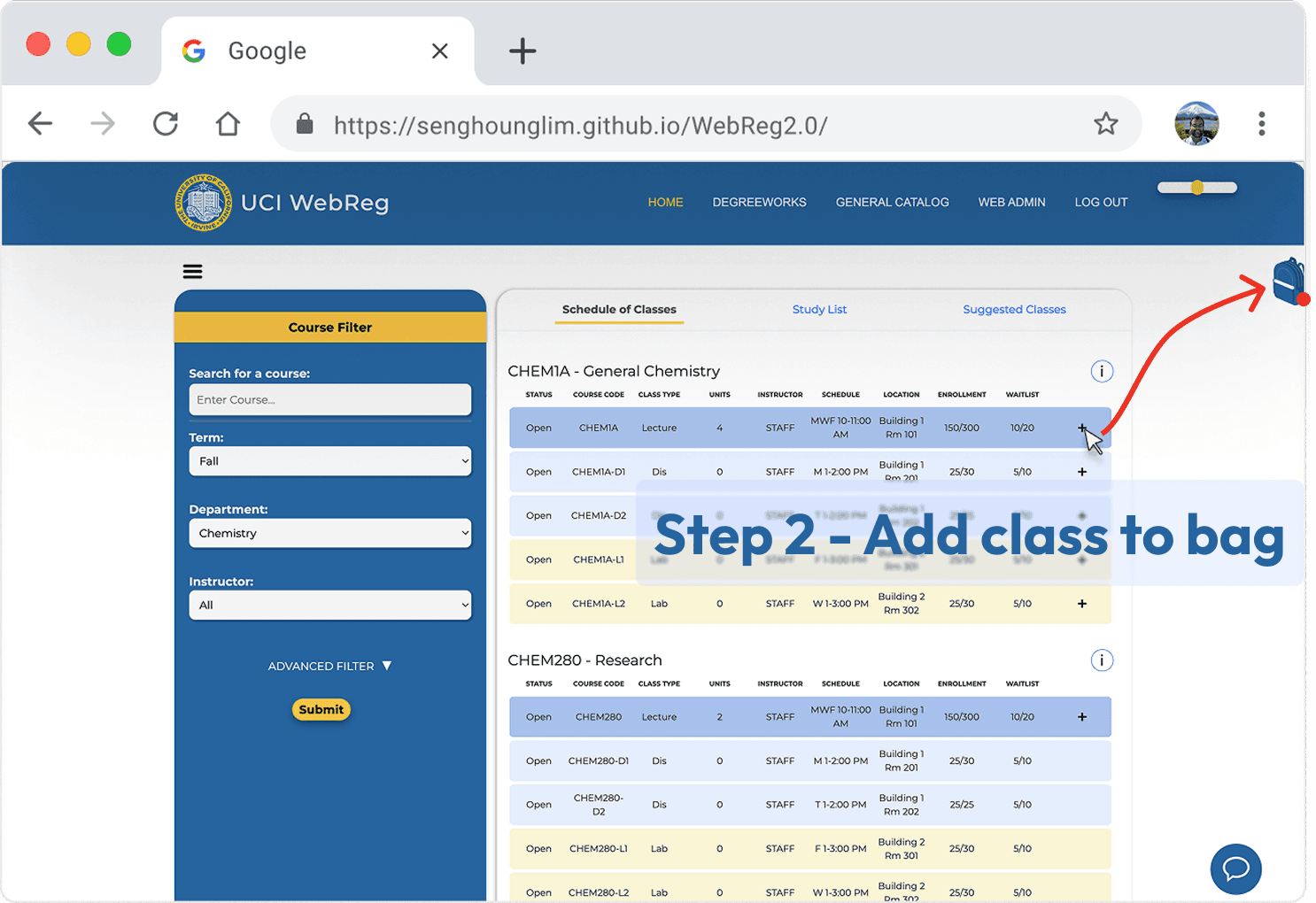
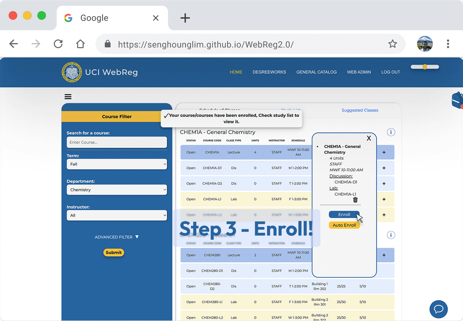
The Final Product
All in 3 Steps
As the lead designer, my primary focus was reducing the cognitive load students faced when navigating multiple tabs just to enroll in a few classes. I redesigned the user flow into a streamlined, three-step process, making registration more focused, efficient, and less overwhelming.
Before vs After
Class Filters
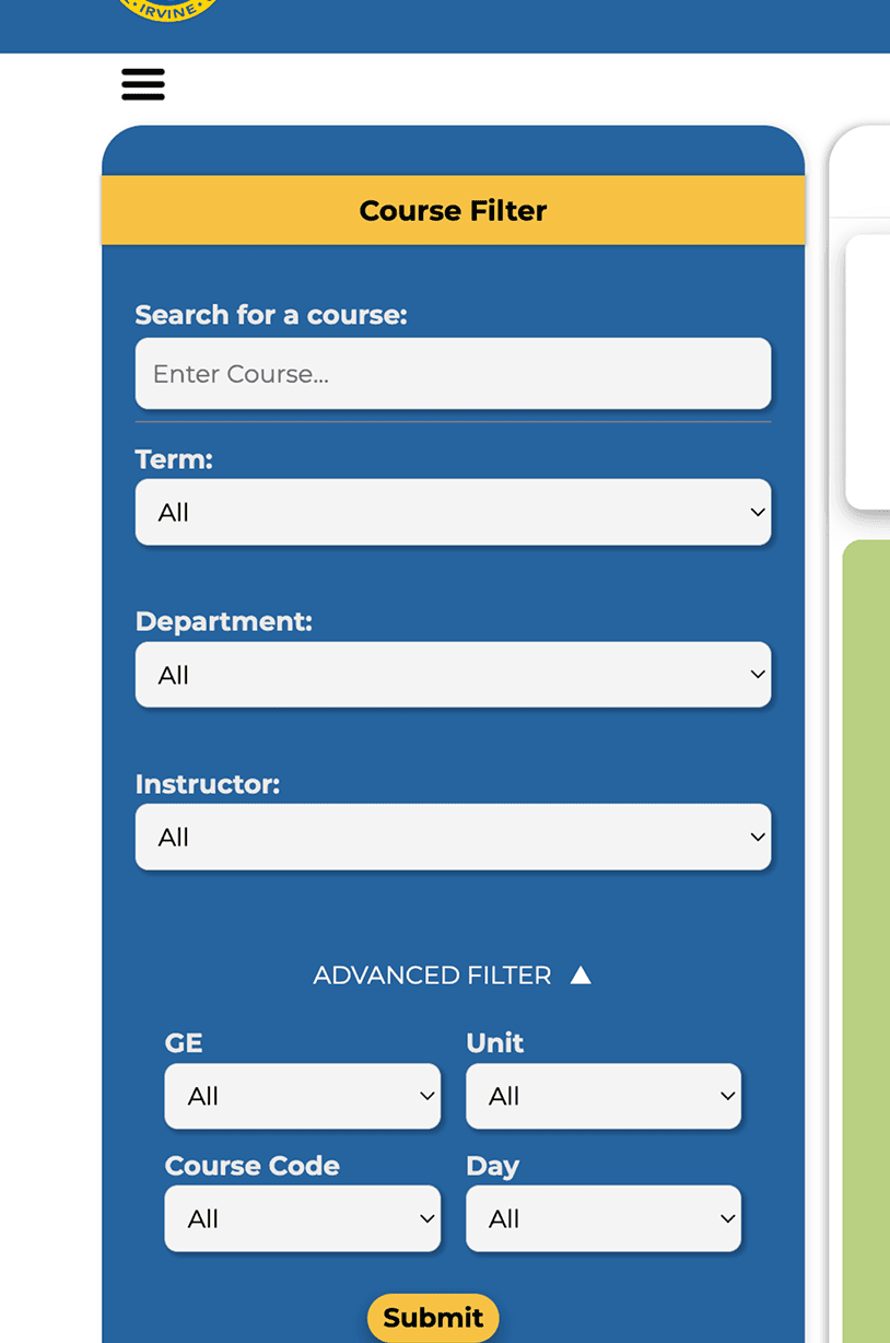
Class Offerings


Our Design Principles
From Principles to Product
Throughout the project, I was driven by three key principles: Intuitive, Foolproof, and Accessible. Every design decision I made aimed to reflect these values—here’s a glimpse into how they shaped the final experience.
Intuitive
Incorporating familiar elements such as the "Bag" feature, which mimics a typical online shopping cart, adds an intuitive and easily comprehensible dimension to this new, unfamiliar system, easing users into its new interface.

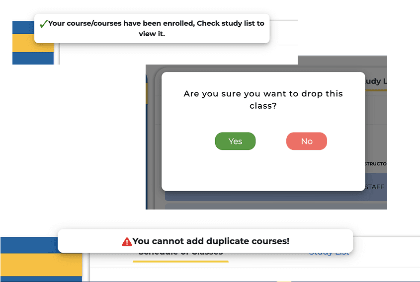
Fool Proof
In the redesigned system, we addressed accidental class drops caused by incorrect class code entries by adding clear confirmation messages before finalizing any drop. These alerts are used across key actions to improve accuracy and enhance the overall user experience.
Accessible
The website is accessible to individuals with visual impairments, featuring screen reader compatibility, alternative text for images, and adherence to WCAG guidelines. It also includes UCI's color palette and a zoom feature for improved accessibility.
Some Last Words
Design That Delivered
Discussions with the University Registrar led to the implementation of our waitlist email idea, where students receive notifications about changes to their waitlist position.
Simplified class registration from multiple steps to just 3 clicks.
Improved system efficiency by reducing unnecessary navigation with 80% reduction in open tabs.
Want to know more?